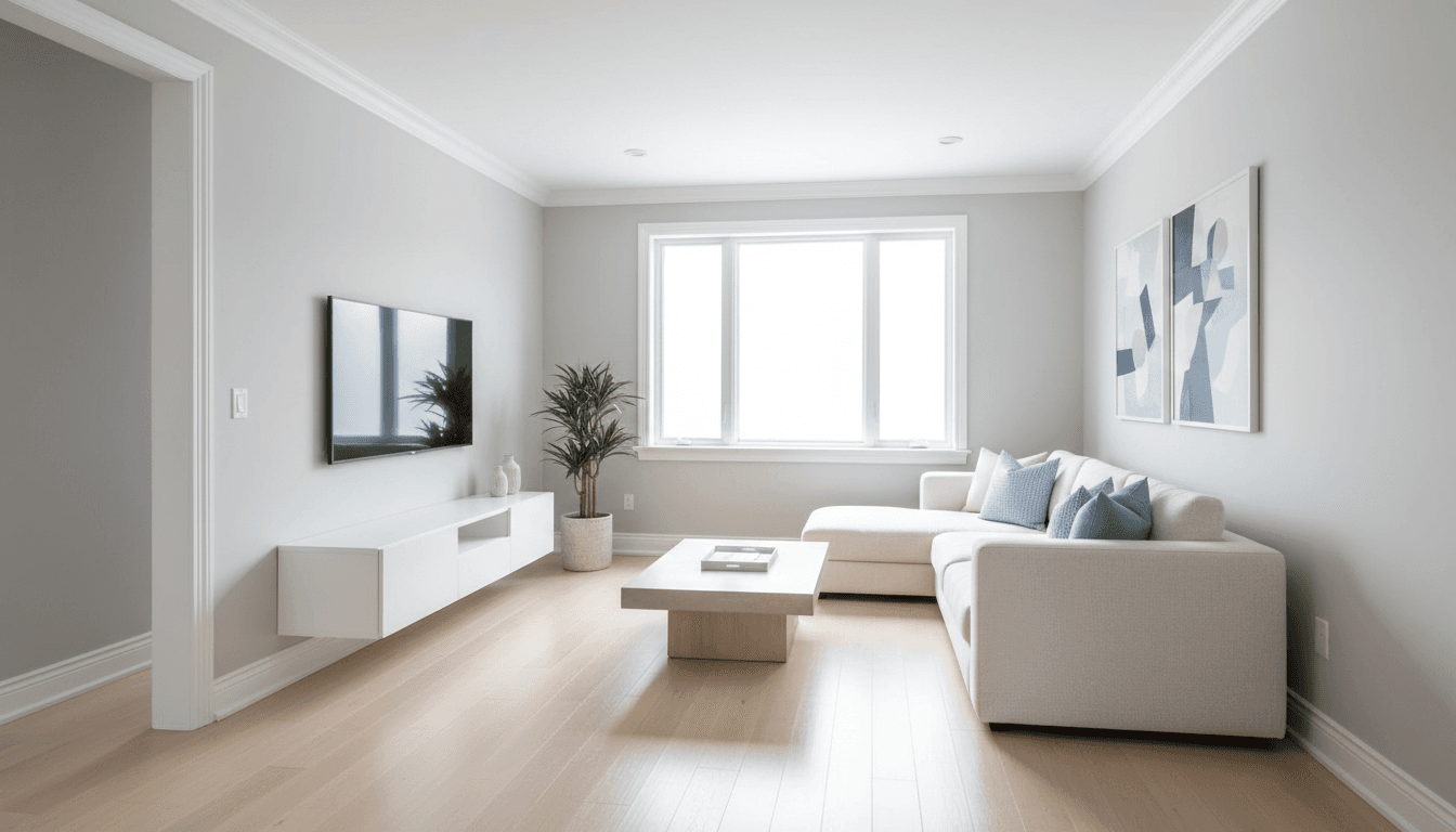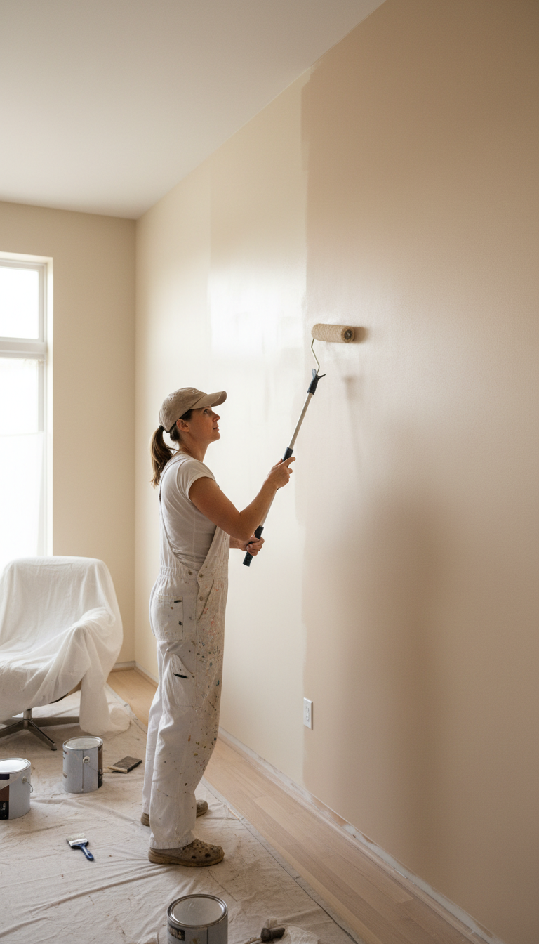
The top warm neutral paint colors 2026 center on organic, earthy tones like Burlap, Neutral Ground, and Creamy, marking a significant shift away from cool-toned grays. These trending palettes feature layered taupes, sandy khakis, and soft mauves that create an inviting and nature-inspired atmosphere in modern homes. By focusing on rich undertones and versatile beiges, homeowners can achieve a sophisticated look that remains cozy and timeless.
Struggling with a home interior that feels more like a sterile gallery than a comfortable sanctuary is a common frustration for many modern homeowners. After a decade dominated by clinical grays, the design landscape for 2026 is shifting toward a more organic, grounded aesthetic that prioritizes visual warmth and lived-in luxury. Choosing the wrong neutral can lead to muddy walls or unexpected yellow undertones, making the selection process feel overwhelming for those seeking a high-end finish. At DNA Pro Painting, LLC, we understand that a sophisticated result requires an expert eye for light, pigment, and application. In this guide, we will explore the definitive warm neutral palette for 2026, including top selections from Sherwin-Williams and Benjamin Moore. You will also learn how Georgia's unique natural light influences these specific undertones and why professional preparation remains the essential secret to a flawless, enduring result.
The Great Shift: Why Homeowners are Moving Past Cool Gray in 2026
For nearly a decade, cool grays dominated the Georgia residential market. This millennial gray aesthetic provided a clean slate, but it often lacked the soul and comfort necessary for a true sanctuary. As we look toward the warm neutral paint colors 2026 homeowners are requesting, we see a distinct departure from those clinical undertones. The shift is psychological; homeowners are moving away from the starkness of the past and embracing an organic, earth-driven palette that feels intentional and grounded.
In Georgia, the quality of light plays a massive role in how color behaves. Our intense Southern sun and high humidity can make cool grays appear icy or even sickly blue. These tones often feel disjointed from the lush, green landscapes surrounding properties in areas like Marietta or Alpharetta. By contrast, warm neutrals bridge the gap between the outdoors and the interior; they soften the edges of a room and create a more welcoming atmosphere. This transition is essential for those seeking quality interior painting workmanship that stands the test of time.
We are also observing a reaction to the recent dopamine decor trend. While vibrant, high-contrast colors had their moment, many residents found that living in a constant state of visual stimulation led to fatigue. The 2026 solution is a return to a sophisticated, neutral foundation. These warmer tones provide a calming backdrop that allows for transforming spaces in Georgia into peaceful retreats. By establishing a balanced base, you ensure that your home remains a place of rest, delivering professional results that prioritize both style and mental well-being.
Top 5 Warm Neutral Paint Colors for 2026
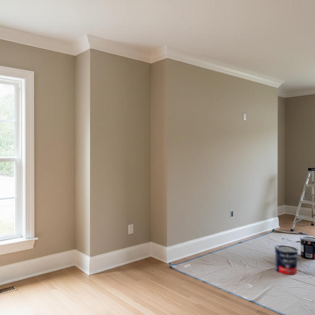
Transitioning away from the starkness of cool tones requires a deliberate selection of hues that provide warmth without overwhelming the architectural details of a home. Based on the shift toward organic, grounded interiors, we have identified five specific shades that define the warm neutral paint colors 2026 market. These selections reflect a move toward pigments found in the natural world, specifically tailored to the unique environments of Georgia homes.
Mushroom Browns (Sherwin-Williams Universal Khaki): Mushroom tones provide a sophisticated depth that standard tans lack. Universal Khaki is a standout choice for open-concept Georgia floor plans. Because many homes in our area feature sprawling layouts with varying light sources, a mushroom brown provides a consistent anchor that adapts well to transitioning shadows. It offers enough pigment to contrast against white trim while remaining firmly in the neutral family.
Elevated Beiges (Benjamin Moore Burlap): This represents a move toward organic textures. Unlike the yellow-heavy beiges of previous decades, Burlap has a refined, sandy quality. It is a preferred choice for living rooms or bedrooms where the goal is to emphasize natural materials like oak flooring or stacked stone fireplaces. It provides a quiet, high-end backdrop that highlights professional results in modern renovations.
Creamy Whites (Sherwin-Williams Creamy): North-facing rooms in Georgia often suffer from a cool, bluish light that can make standard white paint look sterile or dingy. SW Creamy contains a subtle hint of warmth in the base to counteract that coolness. It brings a soft, diffused glow to the space, making it feel like the sun is hitting the walls even on overcast afternoons. This shade is essential for achieving quality interior painting workmanship in darker areas of the home.
Earthy Taupes (Benjamin Moore Smokey Taupe): Taupe is the ultimate bridge for homeowners who are hesitant to leave gray behind entirely. Smokey Taupe offers a balance between a warm stone and a soft wood tone. It is particularly effective in transitional architecture found in areas like Alpharetta, where traditional molding meets modern furniture.
Clay-influenced Neutrals (Sherwin-Williams Reddened Earth): As we lean further into the organic trend, clay tones are becoming a neutral staple. Reddened Earth is a muted, desaturated terracotta that feels grounded. This shade is best for high-ceilinged great rooms; the slight red undertone helps visually stabilize the height, making a massive space feel cozy and intimate.
Paint Color | Brand | Primary Use Case |
|---|---|---|
Universal Khaki | Sherwin-Williams | Large, open-concept floor plans |
Burlap | Benjamin Moore | Rooms with heavy wood or stone textures |
Creamy | Sherwin-Williams | North-facing rooms with limited light |
Smokey Taupe | Benjamin Moore | Transitional homes in Marietta or Alpharetta |
Reddened Earth | Sherwin-Williams | High-ceilinged spaces needing intimacy |
The 2026 Palette: Sherwin-Williams and Benjamin Moore Highlights
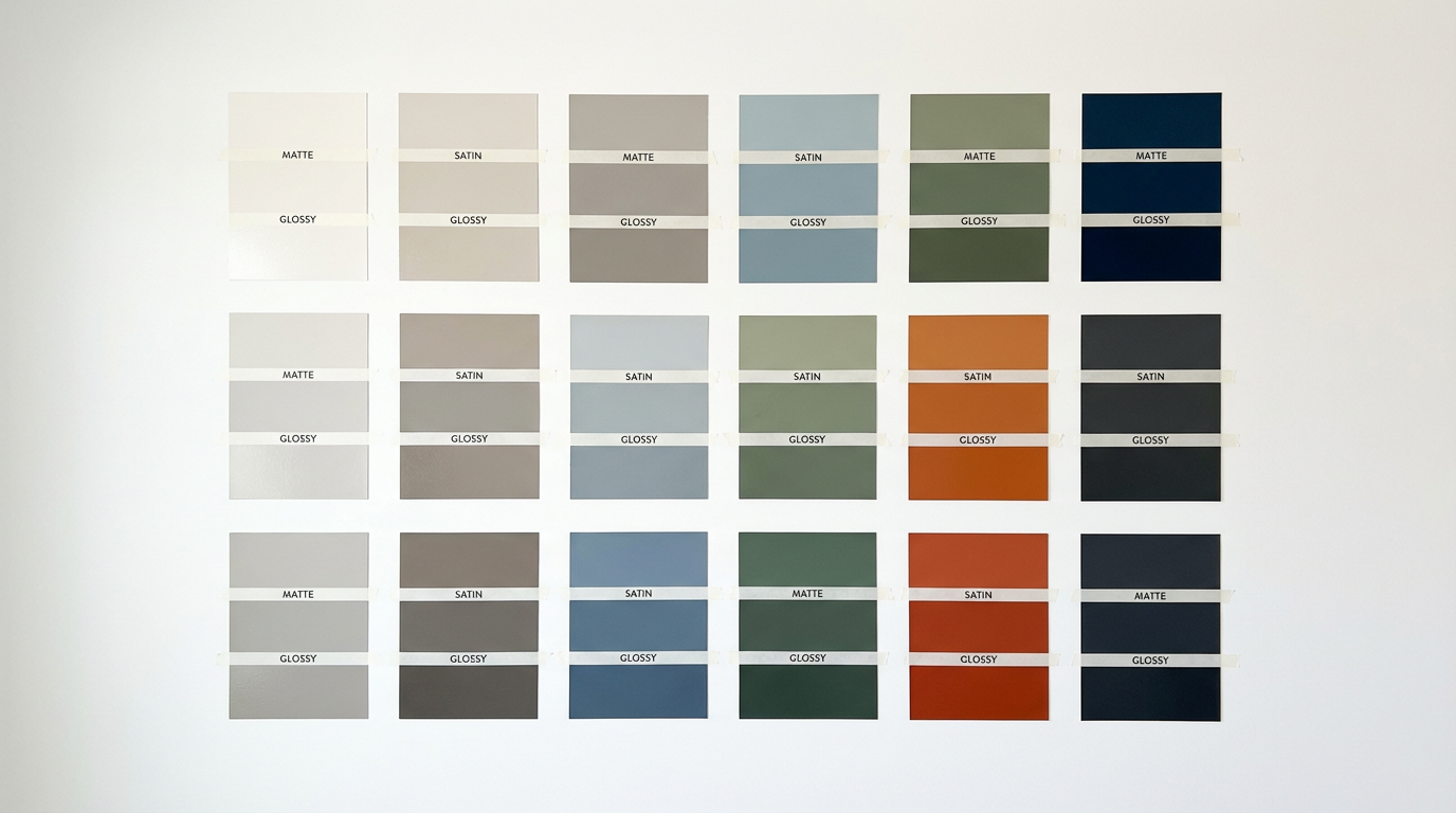
To understand the trajectory of warm neutral paint colors 2026, we must look at the specific pigment shifts within the industry’s leading brands. Sherwin-Williams has moved away from the sterile "greige" era by introducing tones with deeper, earthy anchors. Neutral Ground is a primary example of this evolution; it offers a soft, sun-bleached look that feels organic rather than synthetic. For homeowners seeking more drama, Griffin provides a rich, muddy brown that works beautifully on cabinetry or built-ins. These colors rely on burnt umber and clay pigments to achieve warmth without the outdated yellow cast seen in previous decades.
Benjamin Moore’s 2026 highlights follow a similar path toward sophistication and depth. Silhouette AF-655 is emerging as a critical player for those wanting a darker neutral that avoids looking cold. Unlike the charcoal grays of five years ago that leaned heavily into blue or purple undertones, Silhouette contains hints of red and brown. This creates a "warm charcoal" that pairs exceptionally well with brass fixtures and natural wood common in local renovations.
Selecting these complex hues requires quality interior painting workmanship to ensure the undertones remain balanced across the room. The richness of these pigments, especially in darker shades like Griffin or Silhouette, can shift significantly depending on the application method. Our team focuses on transforming spaces in Georgia by understanding how these specific brand formulations interact with various substrates. When these paints are applied with precision, they deliver professional results that look intentional, moody, and timeless.
How Georgia Lighting Affects Warm Neutral Undertones
The intense latitude of the Southern United States creates a unique challenge for selecting warm neutral paint colors 2026. In Georgia, the sun is remarkably strong, which can cause pale neutrals to appear washed out or blown out in rooms with large windows. Conversely, this warm light often overstimulates yellow or orange undertones, turning a sophisticated beige into a jarring marigold. To achieve professional results, it is critical to understand how our local climate interacts with specific pigments.
We recommend choosing neutrals that feature a slight green or gray anchor. These cool base tones act as stabilizers, preventing the paint from shifting toward an unwanted peach or fleshy hue when hit by the heavy afternoon sun. If you are transforming spaces in Georgia, particularly in tree-lined neighborhoods like Marietta or Alpharetta, the surrounding greenery can also reflect off your interior walls. Testing samples during the golden hour is non-negotiable. This specific time of day reveals the true character of the undertones before the sun dips below the horizon, showing exactly how the warmth will settle into the room.
Securing quality interior painting workmanship involves more than just a clean edge; it requires an eye for these environmental shifts. A color that looks perfect in a showroom may look entirely different in a Georgian great room. By selecting colors with complex, grounded bases, you ensure your home maintains its intended atmosphere regardless of the humidity or light intensity outside.
Trending Living Room Combinations: Pairing Neutrals with 2026 Accents
While a standalone neutral provides a clean slate, the most successful living room designs for 2026 utilize these hues as a foundation for rich, organic accents. Sage green remains a top performer, offering a botanical calmness that complements the earthy undertones found in popular mushroom browns. For homeowners seeking more vibrancy, terracotta and clay tones provide a Mediterranean warmth that feels sophisticated rather than rustic. These accents are particularly effective on feature walls, built-in shelving, or fireplace surrounds, providing a grounded focal point within a neutral envelope.
The concept of tonal spaces is also gaining significant traction in Georgia interiors. This technique involves painting the walls, trim, and ceiling in varying shades or finishes of the same warm neutral. By removing the high-contrast white break at the crown molding, the room feels taller and more cohesive. This approach is highly effective for transforming spaces in Georgia that feature traditional architectural details like tray ceilings or heavy wainscoting. It allows the craftsmanship of the millwork to speak for itself without the visual clutter of multiple clashing colors.
Deep, rich blues like navy or charcoal with warm undertones are also becoming a preferred choice for grounding the warm neutral paint colors 2026 palettes. When these colors are integrated through cabinetry or an accent wall, they provide the visual weight necessary to balance lighter, creamy whites. Achieving this level of sophistication requires quality interior painting workmanship to ensure sharp, clean lines between the contrasting tones. When executed correctly, these combinations produce professional results that feel curated, intentional, and perfectly suited for the evolving tastes of Georgia homeowners.
The Professional Edge: Why Meticulous Preparation Matters for Neutrals
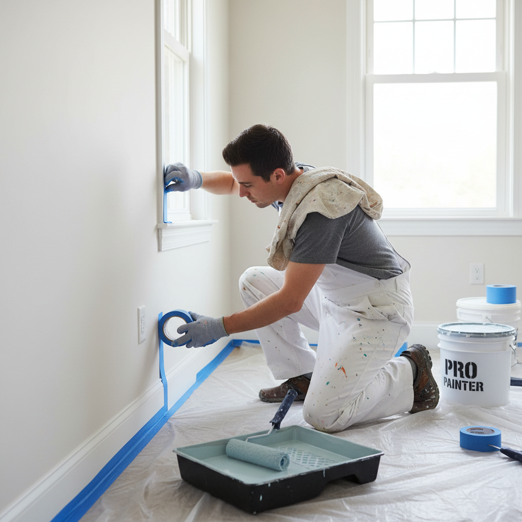
Achieving a high-end aesthetic with the warm neutral paint colors 2026 collections requires more than just a premium bucket of paint. Light neutrals and creamy whites are notoriously sensitive to surface texture. Because these colors reflect more light than the outgoing cool grays, they tend to highlight every micro-indentation, drywall scar, or nail pop. Without quality interior painting workmanship, these imperfections create unwanted shadows that disrupt the soft, organic glow these palettes are meant to provide.
At DNA Pro Painting, LLC, our preparation phase is as intensive as the application itself. We follow a rigorous protocol to ensure the substrate is ready for light-reflective pigments:
Surface Decontamination: Removing dust and oils that interfere with pigment adhesion.
Structural Repair: Systematic filling of all voids, from hairline cracks to deep dents, using high-performance compounds.
Progressive Sanding: Mechanical sanding to achieve a uniform surface, ensuring the wall is flat across all light angles.
Specialized Priming: Applying high-build primers to seal the surface and provide a consistent base for the final color.
This level of detail is especially critical for the 2026 trend of color washing. This layered, translucent technique relies on a perfectly smooth surface to appear intentional. If the wall is uneven, the glaze will pool in low spots, making the finish look messy or accidental rather than sophisticated. By prioritizing these foundational steps, we ensure that transforming spaces in Georgia results in professional results that stand up to both the bright Southern sun and the scrutiny of close inspection.